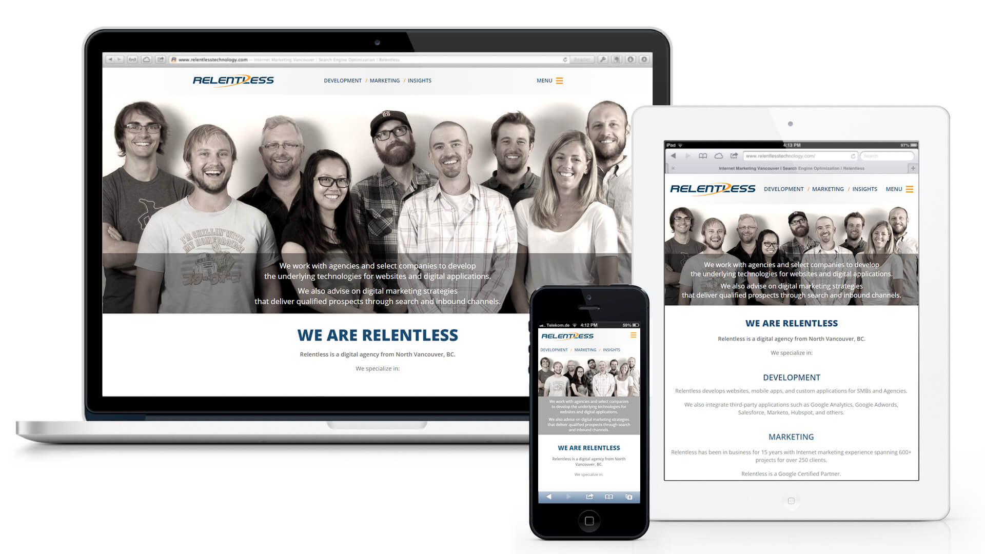
Responsive Design
Build a website once, and it works seamlessly across thousands of different screens.
Web publishers and businesses have seen a major shift in the consumption and device preference of web visitors over the last few years. We have entered into what is being called the “Post PC” era where users are moving beyond the traditional desktop computer, towards mobile devices such as laptops, smart phones, tablets and even Internet-enabled televisions and car systems. For businesses that rely on the Internet for commerce, and as web developers who build and service those web businesses, you have to react to these changes or risk being left behind.
But people aren’t just getting rid of their desktops entirely. Instead the pattern is that of a multiple screen, multiple device world, where people will often times be on two devices at the same time; watching TV while browsing Twitter on their phone for example.
For a business owner, this is important for a few reasons, most importantly the design and presentation of your website. How do you present a consistent user experience of your website when users are browsing it with several different screen sizes that all might have different abilities?
The solution is to make your website work equally well on every possible device across all platforms. The solution is a responsive design.

What is Responsive Design?
In simple terms responsive design means your website will figure out the screen size and capabilities of your visitor and display the most appropriate design for them. This means images might resize, the text size can change along with columns and layout, navigation, as well as attributes for touch sensitive devices.
The design can also change for the suspected intentions of the visitor by device type. For example, if the visitor is coming in from a mobile device and your website is a locally focused service, it is probably a good idea to display the phone number up front so it can easily be “tapped” to initiate a phone call. Mobile phone visitors might also benefit from a clickable map right up front, as opposed to a 3000 word article about your business. Your visitor is likely on the go, and not in “sit back and read mode”. Your design can attempt to accommodate them and give them what they likely need.
How Many Different Screen Sizes Are There?
You would be surprised at just how many different screen sizes there are. Not only that, but there are also different screen resolutions, screen densities, and orientations. There are literally thousands of combinations.
Samsung ships the most smart phones out of any company and offer 27 different Android screen sizes. That’s just one manufacturer, using one mobile operating system, and doesn’t even include desktop or laptop models that have an even bigger range.
Apple has the second largest market share of mobile devices and healthy amount of laptops and desktops. They offer 10 screen sizes with various pixel densities.
But Does My Business Need Responsive Design?
If you haven’t considered mobile at all, you are about 8 years behind. If you’ve built a separate mobile version of your website, you are only about 6 years behind. Separate mobile designs can buy you some time until you can invest into a proper responsive design, but have limitations. If you’ve ever been forced to use a mobile phone design while on your iPad you’ll appreciate those limitations. Stretching a phone design across an iPad screen is usually not the best option for the user.
The design process can be a time consuming process for a business, sometimes taking months just to come up with the colour and aesthetic choices. But the tech industry moves fast and sometimes, by the time a new website is launched, it can already be outdated. Now imagine if you had a separate mobile design you hadn’t even gotten to yet.
You need to use responsive design so that you can stay on top of all the devices, and all the screen sizes being released. As more and more devices are getting Internet access, it is only going to get bizarre. We are heading into an era of smart TV’s capable of web browsing. It won’t be long before other surfaces of your house are web enabled as well; imagine a fridge with an iPad-like screen embedded into it.
It’s Not About Devices, It’s About Personal Modes
As web designers and business owners, we have to be ready for a time when there will be devices in literally all shapes and sizes. The computers we think of today, with rectangular screen sizes, will be just one of many different ways in which we interact with the Web. From smart phones, TV’s and other household appliances, to wrist watches, flexible e-paper, and practically any surface you can think of, they will all be connected to the Web. The usage distinctions will be made by us and our needs. If we are relaxing, we might be reading the web from a tablet. If we are on the go, we might be using a screen in the dash of our vehicle.
It is sometimes overwhelming to think of all the possibilities that might be introduced. But as we design and optimize online marketing for the future, we have to stay ahead of the curve. Embrace mobile and the multi-device connected world now, or risk being left behind.
Posted on: 05/03/2013
Updated on: 02/26/2015
Posted by: Craig Hauptman – President & Founder
Related Insights:
Search Traffic: Paid vs. Organic – The Fundamental Differences and How to Leverage Each Type
Mobile Majority – Why a Mobile-First Approach is so Important
The AIDA Model – When to Use Specific Digital Ad Platforms Throughout the Sales Funnel
A/B Testing for Continual Improvements – Split Testing for Incremental Website Improvements
AI Chatbots & Search Engines – How AI Chatbots Will Impact Search Engines


